
About us
About us
50 Inspiring ‘About Us’ Page Examples
Active Campaign

Visuals are such a big part of an About Us page, and Active Campaign does a great job showing off their employees and their office environment. They also have a small section describing what a normal day in the office is like. This helps entice prospective employees while also putting a face to the company and making it more relatable.
Backlinko

Brian Dean is a master storyteller when it comes to his SEO content, and his page proves no different. The conversational tone, the two call to action buttons for email signup, and some friendly photos all make this a great About Us page.
Basecamp

Within the lines of text on Basecamp’s page lies some pretty hefty pieces of credibility: the founders wrote two books, one is a best seller; and also created the programming framework Ruby on Rails.
Blue Apron
Overall, Blue Apron’s website has a great user experience. Their fun corporate photos take the spotlight and their value prop is made super clear right off the bat. But what we like best is that the CTA buttons are very clear and show up twice—once at the top and again at the very bottom. Not all companies utilize their About Us page to hire, but when they do, this is how to do it.
Box

Box has a very well-equipped page with some unique features. The first is a simple paragraph that actually acts as a microcosm of a great page. In 5 sentences, it has a mission statement, explains their value, tells a story, gives credibility through users, and ends with a call-to-action to sign up. All of it is addressed to you, the reader.
Buffer

Like Stripe, Buffer also features their staff on almost 50% of their page. Each team member has a bio written in the first person, which is a unique touch that adds a personal connection. Then, after reading about the values and “meeting” their staff, there is a clear CTA to sign up.
Canary
Canary uses a great, crisp video loop as the first thing you see on the page. They have some simple sections explaining their mission statement and story.
Clio
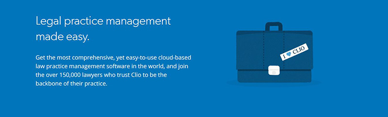
Overall, the Clio website is very well designed. Their About page has some large pictures and a great customer-focused value prop. There are also some links to other pages, like their Careers page, which has a great video and call to action.
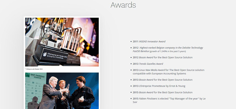
Cloudera
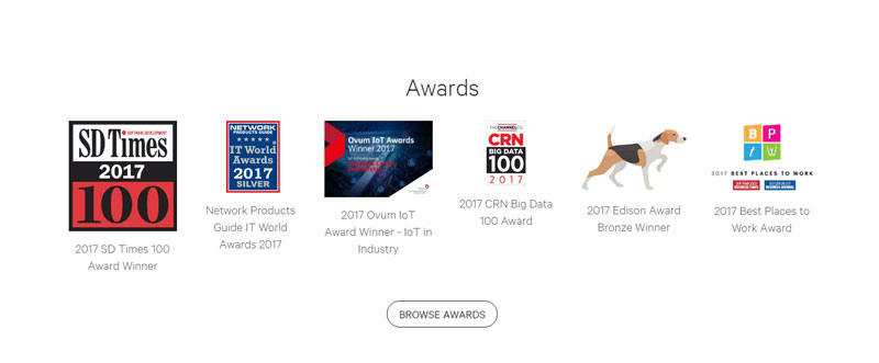
Cloudera has a simple design with clearly defined sections that hit on several marks. They have a large CTA section at the end, but what really stands out the most is the awards section, which provides instant credibility.
Constant Contact

Constant Contact has some great features, including a video and fairly in-depth history of their company. It can all be explained in one simple sentence, which serves as the header for their page: “The tools. The people. The drive to help small business do more business.” They are very clearly customer-focused, which is a big win for their page.
Contactually

This is a great, concise page. “A company built around the user” is exactly the kind of copy you want to see, because it addresses the customer (i.e. user) directly. However, the best part is probably their clear CTA at the bottom guiding the user to exactly the next section they want them to visit: the blog.
Dropbox

The minimalist design of the Dropbox page is part of the allure. Each section utilizes a lot of white space and friendly cartoon drawings to support each point on the page—allowing their value to shine through. The page is also responsive, so the images don’t break when resizing, which is hard to pull off with illustrations, but Dropbox does so beautifully.
Eventbrite

Eventbrite is a great example of a page with an inspiring mission statement coupled with three simple call to action buttons at the bottom. Their statement “Bringing the world together through live experiences”, is inspiring enough that they can then invite the user to ‘host’ an event, ‘discover’ an event to attend or ‘join’ their team.
Freshbooks

Many founders have stories behind their companies that sparked the idea for their product. Freshbooks’ page begins with their story. It simply outlines a pain point that most, if not all, of their customers can relate to. At the bottom of the page, there is a clear CTA for customers to get started.
Freshdesk

This is a neatly designed page that hits on all of the marks. By breaking up the sections in a nav bar, users can easily click through to learn about what they want. The History section has a nice timeline, their Teams section have clever images that animate a bit as you scroll (our favorite part) and the Freshdesk culture is displayed with photos.
Full Sail

Full Sail uses video to address how their courses empower students to be creative. It highlights the important pieces that a student most likely uses to compare school choices (outside of cost), such as the facilities or the culture.
Greatist

When convincing your customer to choose you over the competition, always address them personally. The opening line from Greatist is probably the greatest example of this (sorry, we had to do that.) Seriously though, it works perfectly.
Harry’s

Overall, Harry’s website is beautifully designed. Their page is no different. Beginning with a mission statement that clearly puts the customer first, they continue with a great minimalist design that doesn’t distract from their task at hand—which is to sell you on their razors. Another piece to note is that they include CTA buttons twice on the page while scrolling through.
Hello Alfred

For a company that is designed to make your life easier, their page smartly has a whole section of real customer testimonial videos that really tell the story of how your life will change if you use Alfred. Combine that with a killer design and it makes for a great site.
Help Scout

One of the important aspects of an About Us page is conveying the team and its work environment. This can be difficult if you bill yourselves as a team of remote workers. Help Scout overcame this hurdle by putting a video from their corporate retreat in snowy Colorado. Shot with selfie sticks, goPros, and drones, it shows off that remote workers can come together to have some fun as well.
Hubspot

The first thing that stands out on Hubspot’s page is their slick, responsive design. They have a very inspirational video that outlines their mission, but the best part is the section of customer success stories that display credibility first hand.
Huge

This page hits on all levels. As a design firm, you would expect them to have great video and web design, and they hit it out of the park with each. Their mantra of “client as a partner” encapsulates how they will work with you if you hire them. Our favorite feature is the functional world clocks for each of their locations.
Humaan

Another display of a design company using their skills to create an amazing website. The coolest feature here is the section of animated gifs for each employee that gives a taste of the company’s humor and aesthetic. It conveys the feeling that while they are great at their job, they are also just like you and me.
Hungry Root

Along with their mission statement and a full high-res photos, Hungry Root also supports their beliefs with a simple, yet powerful graphic backing it up. Like photos, visual guides can tell a story and help to bolster your message to seal the deal for a customer.
Infusionsoft

One of the best aspects of Infusionsoft’s page is the first line you see: “We Help Small Businesses Succeed”. This clearly sets them apart from their competition. They also have wonderful visuals of their offices and staff along with expert testimonials, all on a sleek, well-designed page.
Intercom
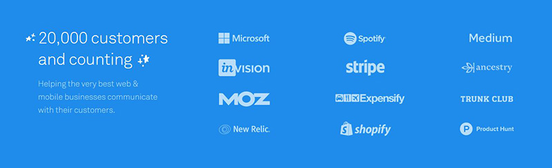
Intercom has created fun cartoon characters to supplement their page. This establishes a fun, playful tone which makes for an enjoyable user experience. They also have a solid section displaying their 20,000+ customers.
Jet
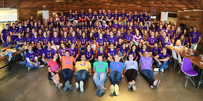
Jet features their entire, smiling company, fully clad in Jet purple. Simple, yet powerful sentences outline their visions, and values. Clicking through you will find a clean design that is rich in quality, not quantity.
Lateral

This page is broken into sections, and puts their team first. They definitely stand by their motto of thinking outside the box in the creative way they display their team. Every team member photo “looks” at where you are clicking! The other subsections hit on all the marks as well with strong imagery and simple messages.
Mailchimp
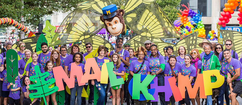
We like MailChimp’s page because of its simplicity. MailChimp paints a picture of their company right out of the gate with a full-width image of smiling, friendly-looking employees. Then, they break down what they do and their value to you in two quick sentences.
The last portion talks about their charitable connection to the community in Atlanta, which is where the company is based. This final piece of information leaves a good taste in your mouth about the business.
Mixd
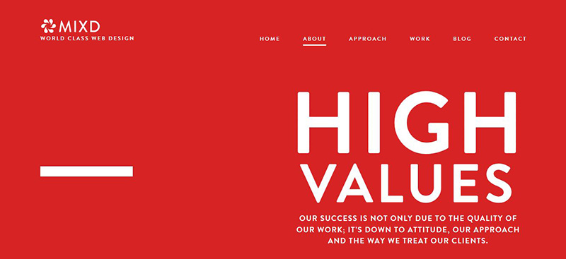
Bold, red colors, simple messages, and finally some amazing looking photos all combine to make a great looking page. The page is also responsive for mobile—and actually crops the photos down to close up photos, rather than just resizing them. This great design builds credibility for a design firm.
Nerdery

Nerdery makes it very clear who they are and what they do for you in one simple sentence. With simple, defined sections—all customer focused—they also have a very clear CTA at the end to get started with them as well.
Nutshell
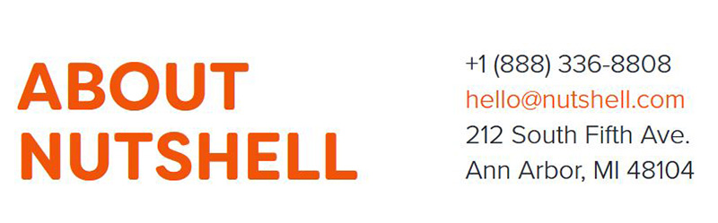
Nutshell’s page includes some key elements—most importantly the contact information displayed immediately above the fold. A study done by Komarkting Associates found that 51% of people think "thorough contact information" is the most important element missing from many b2b websites. Their value prop is also insanely customer focused.
Odoo
Odoo has a great, responsive design that also looks sleek and polished. Their header, “Making companies a better place, one app at a time” helps to answer the question of what they can do for your company. They also add some nice pieces of credibility by listing their multiple awards such as Bossie Awards in 2012, 2013 and 2015 for best open source solution.
Outbrain

Outbrain neatly breaks up their page into five sections, which together form a cohesive picture about their company. Their video is probably the most impressive use of storytelling: it details their values as a company.
Quip
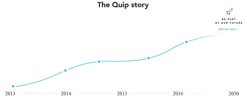
Another beautifully designed page that hits on all the marks, Quip is “A San Francisco company committed to changing the way teams work and helping organizations work less dumb.” They cleverly guide the user through their story and company values with photos.
Rent the Runway
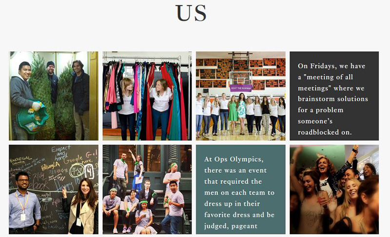
The best part of Rent the Runway’s page is their “Us” section. With fun photos of their staff and some candid quotes about what it is like to work at Rent the Runway, this adds a lot of trust and makes them feel more like people.
Salesforce
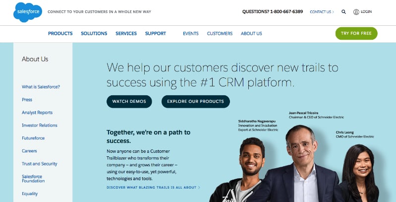
On Salesforce’s page, customer is always the number one focus. With the first line on their page, "We help our customers discover new trails to success using the #1 CRM platform," they clearly display their value to the customer. Their page also features inspiring videos telling the story of Saleforce and has customer success stories.
Scopely
The themes common to Scopely’s page are creativity and fun, which is what would it should be for a video game company. They do a great job conveying this through pictures and colorful graphics. They feature each of their employees, leadership, and give a little taste of the fun that they have in their company.
SpaceX

If you want an example of a stunning timeline for an About Us page, look no further. SpaceX tells its story through its successes (and sometimes failures), but proving that everything is moving forward is an important point that their page helps illustrate for potential investors.
Stripe
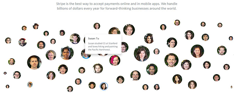
Stripe’s page has a very unique way of featuring their staff. A scrolling set of bubbles displays headshots of their team members that you can then click to learn a bit more about. This works seamlessly as a mobile feature as well.
Another great touch is the way they visualize their office locations. Instead of using an actual map, they have cleverly designed theirs to look like a transit map. Style points all around.
Sunski
As a b2b company, it is harder to get away with showing off the outdoors, but if you are a consumer-facing sunglasses company like Sunski, it is more than OK to embrace it. This is a perfect example of where your timeline can become a great story-telling vehicle and help you relate to the customer on a personal level.
Cornett

Displaying your company values on your page like Cornett is an easy way to let your potential customers see what is "under the hood" of your company. Letting them in on your mantra can help establish trust.
Teamwork

Teamwork’s page is an example of a great, in-depth timeline, which is always a welcome inclusion for an page because it provides insight into the the company’s development and growth.
Another great feature of their site which ties into the About Us page is that there is a large call to action at the footer of the page. This call to action is the next logical step for the customer if you are trying to convert them from your page.
Track Via

This page features a nice video that breaks down their business application in a playful way. This helps establish the tone. An important piece that Trackvia includes is their award from Outside Magazine for ‘Best Places to Work’. This helps attract potential employees, which is a great secondary goal of most About Us pages.
Uber

Uber has a simple story which it cleverly ties into the product with the title “Our Trip History.” They also list their “partners” first (partners are the Uber drivers), then their app team. Giving credit where credit is due is an important detail to convey. Uber would be nothing without their team of drivers, and they correctly highlight that fact.
Ugmonk

This is one of the best storytelling examples on this list. Aside from a fun video, the page has Jeff, its founder, tell the story of how he struggled to answer a difficult question about design, which eventually led him to creating this company. By the end you feel intimately tied to Jeff and Ugmonk’s goals and ideals.
Unbounce

Unbounce’s page is very indicative of a main feature that any landing page should have, which is a clear message. “Unbounce Empowers You to Create Better Marketing Experiences.” This is a great, simple, customer-focused value proposition.
A photograph of the six founders helps to paint a picture of the company’s humble beginnings. Their page also features the company’s core values, which again tell a story about a company that is based on teamwork.
Wufoo

Although Wufoo was acquired by SurveyMonkey in 2011, they have still maintained their identity. This page features a great header image of the team leaders doing their best impression of Wufoo gang-signs. Reading the copy, you’ll find a great example of being funny while still showing off the employee skill level.
Yummly
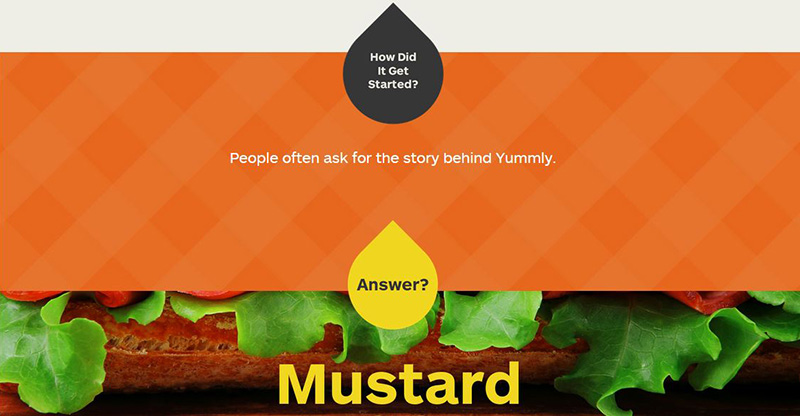
This colorful page from Yummly is short and sweet but still works. While most of the typical information you’d find on an About Us page is actually on other pages on their site, their page has a lot of character and gets you interested in the brand with a simple anecdote about their inception and some bold colors and designs.
Zendesk
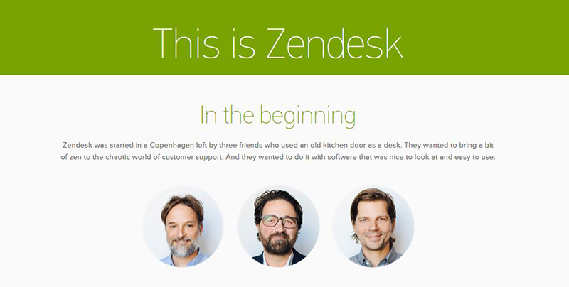
Zendesk features great storytelling, “Zendesk was started in a Copenhagen loft by three friends who used an old kitchen door as a desk...” They also have a fun, beautifully-done video emulating a customer service interaction powered by their software.
Another feature that stands out is a rotating images from their social media that gives a face to their company, and there’s even a bit about their work with charity in San Francisco.
How to Write an About Us Page: Templates, Examples and Samples
An About Us page helps your company make a good first impression, and is critical for building customer trust and loyalty. An About Us page should make sure to cover basic information about the store and its founders, explain the company's purpose and how it differs from the competition, and encourage discussion and interaction. Here are some free templates, samples, and example About Us pages to help your ecommerce store stand out from the crowd.
When it comes to personalizing your online store, nothing is more effective than an About Us page. This is a quick summary of your company's history and purpose, and should provide a clear overview of the company's brand story. A great About Us page can help tell your brand story, establish customer loyalty, and turn your bland ecommerce store into an well-loved brand icon. Most importantly, it will give your customers a reason to shop from your brand.
In this post, we'll give you three different ways to create a professional about us page for your online store, blog, or other website - use our about us page generator, use the fill-in-the-blank about us template below, or create your own custom page using the about us examples within this article.
Use the About Us Page Generator or fill in the template below to have a professional-looking page in minutes.
So let's get started! Since we know you're busy and probably just looking for something to copy/paste, we'll jump right into the About Us Page template. Just fill in the blanks and you'll have a professional-looking page in minutes. After that, we encourage you to read the rest of the article. It explains why About Us pages are extra important for ecommerce sites, gives you some tips on how to build the perfect About Us page that your customers will love, and shows some great example About Us pages to help inspire you.
About Us Page Generator
We've created an automatic About Us Page Generator tool that will give you short, medium, and long versions of About Us page text that you can copy and paste directly onto your website. Just fill in the blanks on the form and get a custom About Us page that you can copy-and-paste directly onto your own website. If you'd rather use a text-based template, there's one below.
About Us Page Template
We've created a sample About Us template designed to work well for virtually any online store, blog, or website. Just fill in the brackets with your company's information and you'll have a professional About Us page written in minutes. If you want to put a personal touch on your page (which we highly recommend), check out the About Us examples below the template.
Copy and paste onto your own About Us page:
Welcome to [store name], your number one source for all things [product, ie: shoes, bags, dog treats]. We're dedicated to giving you the very best of [product], with a focus on [three characteristics, ie: dependability, customer service and uniqueness.]Founded in [year] by [founder's name], [store name] has come a long way from its beginnings in a [starting location, ie: home office, toolshed, Houston, TX.]. When [store founder] first started out, his/her passion for [passion of founder, ie: helping other parents be more eco-friendly, providing the best equipment for his fellow musicians] drove him to [action, ie: do intense research, quit her day job], and gave him the impetus to turn hard work and inspiration into to a booming online store. We now serve customers all over [place, ie: the US, the world, the Austin area], and are thrilled to be a part of the [adjective, ie: quirky, eco-friendly, fair trade] wing of the [industry type, ie: fashion, baked goods, watches] industry.
We hope you enjoy our products as much as we enjoy offering them to you. If you have any questions or comments, please don't hesitate to contact us.
Sincerely,
Name, [title, ie: CEO, Founder, etc.]
5 Tips to Create The Perfect About Us Page
While you can't sell products from your About Us page, the information on this page can help push customers much closer to a sale without even seeing what you have to offer.Below is a quick summary of the 5-part strategy to creating a great About Us page, or you can watch this quick two-minute video for some great insight into each tip:
About Us Page checklist
- Find your Brand Identity & Purpose
- Share your Mission
- Decide on first- or third-person
- Include evocative images
- Keep it brief
About Us Page Examples
If you're just getting started with your About Us page and are looking for some inspiration, here are some About Us page examples we found from Volusion businesses that really caught our eye:Ghurka
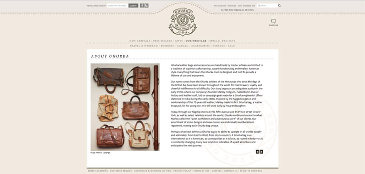
Ghukra is a leather bag and accessory company, and their About Us page goes above and beyond. Not only do they have the standard company history, but they also include the history of the Ghurka soldiers they're named after, a detailed dissection of their logo and in-depth information about their manufacturing. Of course, not every store calls for such a robust About Us, but since this company's inspiration is steeped in Himalayan history, this is an instance where it works very well.
Lunchskins

Who knew reusable Ziploc bags could sound so inspiring? The About Us page of Lunchskins is written in a conversational tone, and opens with soothing, natural imagery and appeals to our feelings of being a part of something larger and doing our part to take care of it. By weaving in bleak statistics on plastic bag use, along with the founders' journey and own struggles, this About Us page paints the picture of an environmentally-concerned family who's worked hard, and wants to share their eco-friendly creation with the world.
Centaur Guitar

If there's a business that knows how to speak their customers' language, it's Centaur Guitar. This rock and roll shop opens their About Us page with the bold statement, "Different. Just like You," and delivers on that promise. From recounting the founders' days playing midnight rock shows, to calling out their guitar megastore competitors, the content on and tone of this page is down-to-earth, no frills and no-nonsense, just like their business.
With Volusion, your About Us page is already built into your store template - just fill in the blanks!
What can a great About Us page do for your business?
Although ecommerce has some incredible benefits, like convenience, efficiency and ease of access, two areas it doesn't naturally excel are warmth and personability. Thankfully, online stores can still match the personal touch of the best brick and mortar stores by doing one thing: telling their stories.
Your About Us page is one part autobiographical, one part educational and all parts human and personal to your customers.
That's where your About Us page comes in. Your About Us page is one part autobiographical, one part educational and all parts human and personal to your customers. It showcases the background of your company, and takes your customer on the journey that has led to your business. Plus, it builds brand trust and loyalty, as well as sets you apart from your competition. Given how much they do, your About Us page is just about the last page you'd want to leave blank.
How to Upload Your About Us Page
If you're using Volusion’s ecommerce software, editing your About Us page is easy — it's already built into your template, so all you have to do is add your store's information. In order to populate your About Us page in your Volusion store, your first step is to head to your store admin. From there, find the Design tab and click on Site Content. Then, on the Update Content: Articles page, find the Company Information section and input whatever text or HTML you'd like, and save your changes. Then visit your About Us page again to see your customized, informative and well-formatted content all there!Your About Us page gives your brand a personality
Many merchants underestimate the impact that a well-written About Us page can make on their business. Use one of the three methods above to write a perfect summary of your brand's history, mission, and goals, and start turning browsers into loyal customers.
Don't have your own ecommerce store yet? Volusion is the easiest way to build your own online store. Designed from the ground up to meet the needs of small business owners, Volusion's all-in-one ecommerce platform lets you build a beautiful, fully-customizable website with no coding knowledge required. Choose a free template and get started with a 14-day free trial.
Do you have any questions about writing an About Us page? Ask them in the comments!
Related Articles
How to Write An About Us Page That Rocks – Tips & Examples

The main problem you see on the average ecommerce About Us page is that it’s totally dedicated to talking about the company. An About Us page that focuses on your ecommerce brand – what a crazy idea!
But consider this – an About Us page isn’t just about you or your company. It’s about why a customer should emotionally invest in your brand. It’s about why you’re the best person to solve your customer’s problem.
And in the world of ecommerce, that’s what you’re doing – building trust and providing a product that solves a customer’s problem.
This article will go over this idea in more detail, concentrating on:
- The role an About Us page plays in your brand image
- What you should and shouldn’t put on your About Us page
- Some killer About Us page examples
So let’s jump straight in!
What is an About Us page
An About Us page gives online shoppers insight into your brand and the people behind it. This can include:
- How you started your brand
- What makes you and your brand unique
- What are your brand values and beliefs
- Why customers should choose you
Take a look at About Us page by the yoga mat company Form. Two short paragraphs clearly define what the brand is all about – product design, sustainability, and performance.
Telling a story on your About Us page is a great way to build trust with your potential customer.
Why?
Because after reading it, your customers are more emotionally invested in your brand. If they can relate to the same values, hardships or victories that you’ve faced, you’ll start to build that rapport.
Why you need an About Us page
An About Us page is crucial when building relationships with your customers. If you’re still not sure whether you need this page on your website, here are a few more reasons why working on it is a good idea:
1. It’s popular with new visitors
On average, more people visit an About Us page than just about any other page on your website. Why is that?
People are naturally curious, and not only about the products. They also love stories and learning more about the brand itself. An About Us page quenches all three of these thirsts. So it’s crucial to create a page that capitalizes on the curiosity of your potential customers.
2. It shows off why you’re unique
No one else is running a business like yours for the same reasons that you are. Your About Us page is a great place to tell this.
Your unique story is what sets yourself apart from the competition and your About Page is the place you can highlight the most important difference. Besides, if people have met similar hardships and triumphs as your brand, they’ll be naturally attracted to your story.
3. It solidifies your brand image
Your About Us page is a great place to affirm exactly who you are and the way you want to be perceived by the word.
Goat Story creates unique coffee accessories for coffee lovers of all kinds. They’ve used a minimalistic photo shoot, with all employees dressed in similar tones and styles to highlight the brand’s image.
Just like their website, product packaging and website copy, there’s nothing that’s obnoxiously loud or distracting – it’s just darn good – like their product. It’s one of the many About Us page examples that somewhat uses psychology to its advantage.
So now that you know the effect a good About Us page can have, read on to see what you need to include into yours!
How to write About Us page
Your About Us page can be made up of whatever you feel is the most important things to your brand. If you’re not sure where to start, here are a few suggestions that make amazing elements of any About Us Page.
But remember that this list is by no means extensive. Depending on your industry specifics, there may be more things that you’d like to include to assert your brand’s position in the market. The following elements are merely a handful of things that can help you do just that.
1. Include a unique value proposition
Find your company’s unique selling point and draw attention to it by building your About Us page around it. For example, if your unique selling point is a lenient returns policy, focus on why you have a lenient returns policy.
If your unique selling point is that your products are sourced from renewable materials, explain why that’s important to your brand.
Identifying your unique value proposition can be challenging if you didn’t start your business having it in mind. Luckily, you can consult specialists at digital marketing agencies that will help you define and introduce your products to customers by highlighting how’s your product is different and why they should care about it.
2. Show your company’s faces
The human eye is naturally drawn to faces. In the previous Goat Story image, I bet that you immediately started to look at the faces of people, and didn’t even notice the coffee they’re drinking.
By including the faces of your founders or the entire team, you can somewhat control where your reader looks. But if you’re a solopreneur, a simple profile shot of yourself should be enough to put a physical face to the company.
3. Tell your brand story
As mentioned earlier, your brand story is what makes you unique. There is no other story quite like yours, so it’s important that you draw attention to it.
Software company Morningscore does this in the form of a timeline of achievements.
As an ecommerce business owner, you too can use timeline storytelling. Important events in your brand’s history can include:
- When you had the idea of your brand
- When you sold your first product
- When you made your first 100 sales
- When you hired your first employee
But of course, it’s not the only way to share your story. Take a look at simple yet original brand story by makeup and skincare brand 100% Pure.
As you can see, brand storytelling lets you connect with your audience through shared values. It’s also one the most powerful ways to breathe life into your brand. So be honest and real about your brand and ideas behind it.
No matter how tempting it might be, don’t write a story that stretches over 2000 words – it’s very unlikely a customer will read it all anyway. Instead, keep it short, relevant and on-point. Avoid being too self-praising, babbling on and going offtopic.
4. Share what’s happening behind the scenes
In a world where the internet is as prevalent as it is (you’re using it now), transparency in manufacturing is a marketable asset – a necessity, rather than an option.
With many brands now appealing to certain audiences by using sustainable materials or paying above minimum wage, consumers want to know the insides of your company more than anything.
Embrace this, and show it off to the world.
Something as simple as a handful of photos of your product being manufactured can be enough to give curious customers a look into the inner workings of your company.
Here you can see how fashion label Intotheam do just that:
Consider using behind the scenes photos along with some text to explain the production process of your items. This leaves your reader feeling that they know exactly what they’re buying and exactly where it comes from.
If you’re a Printful customer, make sure to check out our production footage page. We’ve created a gallery full of photos and videos to help your customers get a closer look at how your products are made.
5. Let customers know where you are
You’d be surprised to learn how much better some customers may feel after learning where your business is based. By mentioning where you’re from, you can further build trust with people of that area.
“Oh they’re located in Sacramento, I used to holiday there!”
Don’t hesitate to mention the location of both your office and where your product is shipped from because it can help erode a buyer’s reluctance to buy from you.
Here’s how Printful solves the ‘I’m worried it’ll take me ages to get my product’ problem:
The answer: “We’re in the US, Mexico, and Europe. It won’t take long.”
6. Direct customer towards the next action
What is the next thing you want your customers to do once they finish reading your About Us page? You probably don’t want them just left sitting there at the bottom of the page with nothing to do.
Create a CTA to send them back to your shop, include a contact form, or get them to sign up to your newsletter.
At this point – the bottom of your About Us page – is a place where your reader is active and engaged with your brand, so use it wisely.
7. Consider the fold
“Above the fold” is the part of the website that can be seen before a user has to scroll. As you’d imagine, this point varies depending on the devices and screen size.
But why you should care about it?
Any marketer in the world of ecommerce knows that capturing people’s attention is only part of the problem. Keeping their attention is just as important. Designing your About Us page with content that’s above the fold encourages a user to scroll down and explore the rest of the page.
You can find the average fold line on your website manually. Just visit your site on a wide range of devices, using different browsers and see where the page usually finishes.
Here’s how Nike website looks when opened on Google Chrome using a 13-inch computer screen:
However, if you want to learn where the average fold line is on your website based on user behavior, you should probably use tools like Hotjar.
8. Keep your About Us page updated
Once you’ve created a killer About Us page, share it with the world. But don’t forget to update it every once in a while.
You see, well-written About Us page can build trust in ways that no other page can. But an old, outdated page shows neglect, and as a result, destroys trust. To avoid this from happening, get into the habit of updating it every 6 months or so.
There are a lot more things you can do and experiment with, so don’t be afraid to try different things. You may like to put a video on your page, or have a contact form on there, too.
What’s best for you and your brand is something that only you can figure out, through regular testing and assessing!
What not to put in an About Us page
Awesome, you now know what should be included in an About Us page, but is there something you should leave out? Of course!
Hype
Save the hype for social media. Your About Us page is to build a rapport and bond with your customers. You don’t do that by saying how you met Elon Musk’s former roommate, or saying how your product is going to disrupt an industry.
Sales pitch
For the same reason that you don’t hype your brand up, you don’t use your About Us page to sell.
While people who are reading this page may be interested in your product, at this moment in time, they’re interested in you. Keep the focus on your brand as an entity and what makes you unique and important – not your products.
Best About Us page examples
Nothing can beat learning from the real-life examples. So let’s take a look at some of the best About Us pages for ecommerce brands, and see why they’re good.
1. Happy Socks
What’s New in the About us?
Screen Shot

System Requirements for About us
- First, download the About us
-
You can download its setup from given links:


